I Don’t Know If I Even Did This Right It Seems Too Complicated Lmao


I don’t know if I even did this right it seems too complicated lmao
Anyways a couple of of you guys have asked me for help on drawing robot bodies cause your confused on mechs a femmes I guess I’ll call them. I used Transformers Prime robots cause they’re not too blocky but not too human looking either. This isn’t a tutorial on how to detail them just how to draw the basic shapes. I hope this at least helps a little bit. sorry for my awful handwriting lol. my text thing doesn’t work on my photoshop
More Posts from Basket-of-references and Others
I feel stupid for asking this so im using anon, but how do you draw the hijab? Whenever I try it looks like an egg www
also, Ramadan Mubarak! May Allah bless you
Don’t feel stupid for asking! Drawing is hard no matter what you’re drawing, so don’t be afraid to ask for help^^ But honestly even I feel like the best of my hijabis look a little egg-like, and that’s okay!


This tutorial is already taking so goddamn long, so I’m just gonna link my coloring and shading tutorial I did a month ago 😭😭

Gosh, I hope what I wrote made sense 😅 But thank you so much for the well wishes! Happy Ramadan (Eid Mubarak at this point WAHHH), and the same to you, may you and your loved ones have many blessings!!
ADDITIONAL REFERENCES
Winchester Meg's Hijab Drawing Tutorial
Souratgar's Hijab Drawing Tutorial
General Tips for Drawing and Shading Fabrics


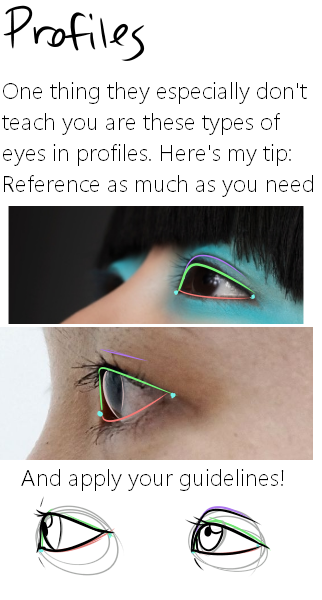
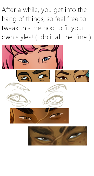
Here it is, my long winded tutorial, complete with some step by step action. I see a lot of people talk about wanting to diversify their artwork but not knowing how. This is my help to you. You really should take the time to invest in learning diverse eye shapes as diverse artwork always makes you a better artist. And frankly I’m really tired of drawing tutorials that talk up character diversity but only have the stereotypical “one Asian eye”.
I did some step by steps for those three diagrams, but I actually got them from this blog which has 14 of those examples! (Bonus: it’s a makeup blog so if you need help with that or want some idea of how to shade these eyes, there ya go)
Digital Painting: tips for beginners
Heyo! I got asked if I could make a tutorial on digital painting so I’m gonna throw together some advice meant for people who are starting out and want to figure out exactly how this stuff all works. Because it’s hard! What I hope to accomplish here is to make painting more approachable for you.
Firstly, I have put together something like this before, so for archival purposes here it is: http://holy-quinity.tumblr.com/post/89594801811/i-dont-know-how-much-of-this-kind-of-thing-you
For those of you who don’t wanna bother reading that, here are the main points:
1. Learn your program and its tools, from brush properties to layer styles. And I mean learn them. Make a cheatsheet that shows you exactly what each button and scale does, both in isolation and in conjunction with other buttons and scales. Refer to this as much as possible until it is intuitive. The end goal is to know exactly what to do to your brush’s settings to achieve a given effect.
2. It’s perfectly okay to use your sketches, linearts, and other forms of line in your paintings. They can help guide the form and there’s no need to make something fully “lineless”! I never make things “lineless.”
3. Study other people’s art and try to think how they could have possibly achieved the effects they did. You can learn a lot just by observing and mentally recreating the process stroke by stroke—muscle memory is a powerful tool at your disposal. This becomes easier to do once you’ve started doing item 1 above.
OKAY!
So where the heck do you even begin?
What I’m gonna do is try to make digital painting as approachable as possible for someone who’s never really done it. The main idea here is that digital painting is just like real painting. So if you’ve ever done real painting, you already kinda know what’s coming.
I’m gonna assume you know the basics of digital art: you can sketch, line those sketches using layers and opacity changes, and fill the lines with color, maybe even opting to add some shading…and you’ll get something like this:

You know, cell-shaded, or maybe the shading’s blended, but you’ve still obviously a line drawing with color put down on layers beneath the lines.
The next intuitive step is to try going “lineless”…but when you remove the lines you get this:

idk about you but I’m laughing at how stupid this looks
When I was first teaching myself to paint digitally, I didn’t really know how to deal with this. Without lines, the form of the subject vanished or became a mess like the above. Even if I was meticulous and careful about placing down the color such that without the lines layer turned on, the shapes fit together, it didn’t look quite right. There’d be gaps, I wouldn’t know how to incorporate the subject into a background, the contrast wouldn’t be high enough, or it’d just in general look too much like a screenshot from Super Mario 64.
Painting requires a different process than the above. You’ll have to let go of some of your habits and conventions. Such as staying in the lines. Such as fully relying on the lines. Like, I love my lines, I love my sketches—but in painting, they are guides for form, and are not the form itself. So let me go through how I approach a given painting:

My painting process starts with a sketch (here a boring portrait for demonstrative purposes). I make the opacity of the sketch layer something like 30%, and then throw down my base colors on a new layer underneath. I’m not being meticulous about the sketch itself, because again it’s just meant to guide my placement of color. I’m also not meticulous about my placement of the color.
We’re essentially sketching with color. Because ultimately what we want is for the color to take on the form and shapes conveyed by the sketch.
There’s a lot going into this about how to use value, how to shade, how to use color, etc. that I’m kinda skipping over because it takes a lot of time to explain…but there are hundreds of tutorials out there on those topics so please, google around! I found some helpful tuts that way when I was starting out.
Something I find v useful is to keep selecting colors that already exist in your image for shading and hue adjustment. This is why I start with really blendy, low-opacity brushes when throwing down color on top of the background. I can then select colors within there that are a mix of the two.
For instance, I’ll select the color of the lines here:

…and use that to shade:

And maybe I’ll select one of the darker shades around his eye, but not the darkest, to make the shading a smoother gradient…and so on.
What I do in general at this point is go over the shapes and lines of the sketch. Such that I can turn off the sketch layer and see this:

I’m replacing the lines with shading and value. I’ll continue to do this as I keep adding color.

This is all super loose. I am not dedicated to any particular stroke. I just want the colors and shading and light source to be right. I’ll use overlay layers to boost contrast or add a hue.
Here are other examples where I used this process:


I am constantly changing brushes and brush settings as I paint. It really depends on what effect I want where. I am also constantly selecting new colors and applying or blending those in. I don’t believe in having some uniformly applied base color and then shading with only one or two…that’s what I’d do if I was cell-shading like the first drawing I showed you here, but painting should be about messing with color and opacity and blending to make millions of hues!
Good rule of thumb: Hard, opaque brushes for applying color. Soft, dilute brushes for blending colors. Sometimes hard, dilute brushes can make some cool blending effects! I personally prefer harder edges on my shading so that’s a brush I use often.
This is getting a bit long so I’m gonna split it up into multiple parts, but really what I want you to get from this is:
1. learn the tools at your disposal until they are intuitive
2. sketch and line are guides for form, not the form itself
3. rather, hue and value will produce the form
And of course, practice makes perfect!!! Every drawing you make, every painting you make, will bring you one step closer to the artist you want to be, and thus every drawing and every painting, no matter what, is a success.
🌸Describing Scents For Writers 🌸| List of Scents
Describing aromas can add a whole new layer to your storytelling, immersing your readers in the atmosphere of your scenes. Here's a categorized list of different words to help you describe scents in your writing.
🌿 Fresh & Clean Scents
Crisp
Clean
Pure
Refreshing
Invigorating
Bright
Zesty
Airy
Dewy
Herbal
Minty
Oceanic
Morning breeze
Green grass
Rain-kissed
🌼 Floral Scents
Fragrant
Sweet
Floral
Delicate
Perfumed
Lush
Blooming
Petaled
Jasmine
Rose-scented
Lavender
Hibiscus
Gardenia
Lilac
Wildflower
🍏 Fruity Scents
Juicy
Tangy
Sweet
Citrusy
Tropical
Ripe
Pungent
Tart
Berry-like
Melon-scented
Apple-blossom
Peachy
Grape-like
Banana-esque
Citrus burst
🍂 Earthy & Woody Scents
Musky
Earthy
Woody
Grounded
Rich
Smoky
Resinous
Pine-scented
Oak-like
Cedarwood
Amber
Mossy
Soil-rich
Sandalwood
Forest floor
☕ Spicy & Warm Scents
Spiced
Warm
Cozy
Inviting
Cinnamon-like
Clove-scented
Nutmeg
Ginger
Cardamom
Coffee-infused
Chocolatey
Vanilla-sweet
Toasted
Roasted
Hearth-like
🏭 Industrial & Chemical Scents
Metallic
Oily
Chemical
Synthetic
Acrid
Pungent
Foul
Musty
Smoky
Rubber-like
Diesel-scented
Gasoline
Paint-thinner
Industrial
Sharp
🍃 Natural & Herbal Scents
Herbal
Aromatic
Earthy
Leafy
Grass-like
Sage-scented
Basil-like
Thyme-infused
Rosemary
Chamomile
Green tea
Wild mint
Eucalyptus
Cinnamon-bark
Clary sage
🎉 Unique & Uncommon Scents
Antique
Nostalgic
Ethereal
Enigmatic
Exotic
Haunted
Mysterious
Eerie
Poignant
Dreamlike
Surreal
Enveloping
Mesmerizing
Captivating
Transcendent
I hope this list can help you with your writing. 🌷✨
Feel free to share your favorite scent descriptions in the replies below! What scents do you love to incorporate into your stories?
Happy Writing! - Rin T.
Write fanfic for yourself.
Publish fanfic for the rotation of 3-6 people who are devoted readers and will either go feral or leave you very nice words and yell with you about it.

So you might be saying: Lion why a guide on drawing black people? Well young blood it’s because a lot of people cant…seem…to draw…black people..Amazing I know.

Racist (caricatures) portrayals of black people have been around forever, and to this day people can’t seem to draw black people like they are human. If your artwork resembles any of the above even remotely your artwork is racist and offensive. If you try to excuse that as a stylistic choice you’re not only a terrible artist, but racist too!!! Congrats.

Whitewashing is also a problem. A lot of people refuse to draw black features on canonly black characters. While this example isn’t colored, lightening the skin-tone of a character is also considered whitewashing. So lets start with features!

Now all black people have different noses thats a no-brainer, but black noses tend to have flatter bridges, and wider nostrils. Please stay from triangular anime noses and small button noses. Your drawings should not depict black people with abnormally large noses. (Especially if you do not draw other characters this way)

If you feel like the way you draw lips on black characters is offensive or resembles a caricature,it probably does and you should change it. ABSOLUTELY AVOID PLACING LIPS AT THE BOTTOM OF THE FACE.

Hair is so diverse! Please get used to drawing braids, locs,kinks and coils! If you can learn to draw ringlets and long waves you can learn how to draw black hairstyles.

Add clips! Learn how to draw baby-hairs and never be afraid to add color Pinterest and Google are free my dudes! Also try using square brushes for blocking in coils.
OK THAT’S ALL YOU GUYS

hot artists don't gatekeep
I've been resource gathering for YEARS so now I am going to share my dragons hoard
Floorplanner. Design and furnish a house for you to use for having a consistent background in your comic or anything! Free, you need an account, easy to use, and you can save multiple houses.
Comparing Heights. Input the heights of characters to see what the different is between them. Great for keeping consistency. Free.
Magma. Draw online with friends in real time. Great for practice or hanging out. Free, paid plan available, account preferred.
Smithsonian Open Access. Loads of free images. Free.
SketchDaily. Lots of pose references, massive library, is set on a timer so you can practice quick figure drawing. Free.
SculptGL. A sculpting tool which I am yet to master, but you should be able to make whatever 3d object you like with it. free.
Pexels. Free stock images. And the search engine is actually pretty good at pulling up what you want.
Figurosity. Great pose references, diverse body types, lots of "how to draw" videos directly on the site, the models are 3d and you can rotate the angle, but you can't make custom poses or edit body proportions. Free, account option, paid plans available.
Line of Action. More drawing references, this one also has a focus on expressions, hands/feet, animals, landscapes. Free.
Animal Photo. You pose a 3d skull model and select an animal species, and they give you a bunch of photo references for that animal at that angle. Super handy. Free.
Height Weight Chart. You ever see an OC listed as having a certain weight but then they look Wildly different than the number suggests? Well here's a site to avoid that! It shows real people at different weights and heights to give you a better idea of what these abstract numbers all look like. Free to use.
if ur ever feeling bad about your art just remember your twelve year old self would think it was soooo cool
did you know moa (the hatoful boyfriend creator) has a blog page solely for references of hands?
well now you do, and here it is!
-
 laurellancesource liked this · 1 year ago
 -
 awayneistaken liked this · 1 year ago
 -
 basket-of-references reblogged this · 2 years ago
 -
 w-to-the-aow liked this · 2 years ago
 -
 crows-life-blog liked this · 2 years ago
 -
 dresarolightdark liked this · 3 years ago
 -
 daiana-ni liked this · 4 years ago
 -
 primecrazyblitz reblogged this · 5 years ago
 -
 tf-rosesong liked this · 5 years ago
 -
 cheesestickhome liked this · 7 years ago
 -
 invalidincorrect liked this · 7 years ago
 -
 copperbora liked this · 7 years ago
 -
 frosty-ass-dragons liked this · 7 years ago
 -
 ancienthare liked this · 7 years ago
 -
 darkfangx399 liked this · 7 years ago
 -
 the-galactic-pretty-boy liked this · 7 years ago
 -
 toxic-headset liked this · 7 years ago
 -
 ncc-rk800 liked this · 7 years ago
 -
 blown-blooms liked this · 7 years ago
 -
 mechanomorphic liked this · 7 years ago
 -
 scrapstream reblogged this · 7 years ago
 -
scrapstream liked this · 7 years ago
-
 mydarkladydragon liked this · 7 years ago
 -
 jadestarfish liked this · 8 years ago
 -
 fire-flame liked this · 8 years ago
 -
 moss-feratu reblogged this · 8 years ago
 -
moss-feratu liked this · 8 years ago
-
 x-galactic-star-x reblogged this · 8 years ago
 -
x-galactic-star-x liked this · 8 years ago
-
 zerolifex-blog liked this · 8 years ago
 -
 daydream1013 reblogged this · 9 years ago
 -
 soulstriderstory reblogged this · 9 years ago
 -
 wtf-halo liked this · 9 years ago
 -
 acetral liked this · 9 years ago
 -
 epona-kelpie liked this · 10 years ago
 -
 curleyyque liked this · 10 years ago
 -
 nightstreak1 reblogged this · 10 years ago
 -
nightstreak1 liked this · 10 years ago
