Curly Hair Heathcliff

curly hair heathcliff
More Posts from Silvariations and Others
STRAIGHT DIVORCE GAY MARRIAGE LIKE TO BOOST REBLOG TO CAST
A (Somewhat Incomplete) Guide on How to Fake Sinner Profiles


LIMBUSIFY YOUR ARTSTYLE (optional)
The core components of limbus companies artstyle are as follows:
Textured, ink pen like lineart
Desaturated colours leaning towards the outermost area of the colour square
Cell shading with some texture
lots and lots of visual effects. God have mercy
Keep references around while drawing, as there are often lots of small details and these will be your guide for not going too crazy with your noise effects.
2. BACKGROUNDS
In the interest of saving time, here’s a free template for you to use. Feel free to change up the background colour however
Key notes:
The background colour loosely matches to the sinner’s eye colour, however usually slightly more saturated.
the outer border is lined thinly by black. This also covers the limbus logo section.
3. TEXT
The font for the light yellow text for your sinners weapon is Futura Condensed Medium. There’s a slight black backdrop to it you can get from duplicating the text and lowering it slightly.

4. EFFECTS
Sharpen, noise and blur will be your best friends here. Too high quality of a character sprite can make it not mesh with the background, and look odd when matched with canon portraits. Here’s a step by step process:
Add wear to the portrait with textured brushes, low opacity and blending modes. I’d generally suggest using gouache or watercolour brushes very lightly to establish texture, then going back in more strongly to indicate dirt and grime. Always use a coloured shadow.
using a blur filter, blur your character on the lowest setting possible, to the point it’s almost unnoticeable.
If your program has a layer texture filter, switch to the noise option and lightly cover the portrait with a thin layer of noise texture. If not, use your pen’s texture settings OR download a png of noise texture and set the layer it’s on to multiply, then lowering the opacity to around %5-10.
Apply a sharpening filter very lightly, only to the point where when zoomed in light colour separation and grain from the lineart can be seen.
aside from that, I’d always recommend playing around with colours, light and textures to make the portrait fit closer.
In the end, it can look something like this!

To conclude this, have fun, go crazy, and suggestions on how to improve this guide are very much encouraged.
UpperMoon incorrect quotes I accept as canon (pt. 5)


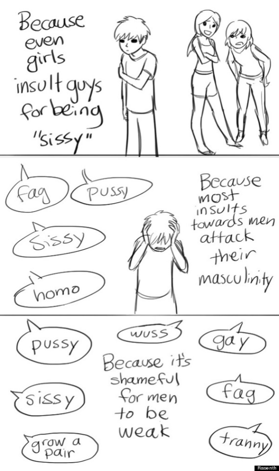


Original comic by Rasenth
I remember a post about Spiderman being an honorary magical girl and I have a own little additional opinion:
Ben 10 and Danny Phantom should also be honorary magical girls
Reasons:
- They have transformation scenes
- They are teenagers (like the ones I'm familiar with)
- They have/had a weekly villain format of episodes
- They got dark at certain points (I'm not sure about most magical animes but I know that Madoka is definitely dark)
- Why not?
every time i listen to “you’re a mean one mr. grinch” i can’t help but sit there and think “what did the grinch do to hurt you?” because dude just stands there for 2 minutes and 58 seconds and drags the grinch into the dirt
Ah yes, the three genders, man, mythical, Oddyseus

I was being cancelled because apparently it was classist to put feathers on dinosaurs.
Both dream me and irl me were very confused.
I think it’s pretty underrated that when making the Andromeda 5, they went Fire is pure radiation heat, Electricity is a jellyfish, Water is an oyster / barnacle, Earth is an armadillo / pangolin.
You’re nodding along. It’s pretty standard and straightforward. Nothing crazy.
Then for Air they make a giant turtle that turns into a fan. Because why not.
I'm sure this has already been said, but we need a proper prestige TV adaptation of Moby-Dick. For 10 minutes out of every episode, it becomes a nature documentary about whales.
-
 aesop-txt liked this · 3 weeks ago
 -
 bad-artist-kira liked this · 1 month ago
 -
 sarukahparullah liked this · 1 month ago
 -
 redmasksnail liked this · 1 month ago
 -
 pr0v1t4 liked this · 1 month ago
 -
 silvariations reblogged this · 1 month ago
 -
 portalcartoon liked this · 1 month ago
 -
 acenintendogs liked this · 1 month ago
 -
 valenceasimov reblogged this · 2 months ago
 -
 fatherofgeckos liked this · 2 months ago
 -
 averysmallblob reblogged this · 2 months ago
 -
averysmallblob liked this · 2 months ago
-
 pvmpkingod liked this · 2 months ago
 -
 wwaywardmermaid liked this · 2 months ago
 -
 noymablueee liked this · 2 months ago
 -
 livienvi liked this · 2 months ago
 -
 vvettaka reblogged this · 2 months ago
 -
vvettaka liked this · 2 months ago
-
 harukalikescoffee liked this · 2 months ago
 -
 lycorira liked this · 2 months ago
 -
 blobpotato liked this · 2 months ago
 -
 theshortiesupreme reblogged this · 2 months ago
 -
theshortiesupreme liked this · 2 months ago
-
 nickthespaceman reblogged this · 2 months ago
 -
nickthespaceman liked this · 2 months ago
-
 atelierlogic reblogged this · 2 months ago
 -
 timaeustestifie-d reblogged this · 2 months ago
 -
 fox-fox234 liked this · 2 months ago
 -
 fluffheaded liked this · 2 months ago
 -
 iropholite liked this · 2 months ago
 -
 aabluedragon liked this · 2 months ago
 -
 agooduser liked this · 3 months ago
 -
 friendofoyster liked this · 3 months ago
 -
 xanntheose liked this · 3 months ago
 -
 crownlandssun liked this · 3 months ago
 -
 nicris liked this · 3 months ago
 -
 dusty-rubies liked this · 3 months ago
 -
 the-black-cats liked this · 3 months ago
 -
 barleyparley liked this · 3 months ago
 -
 monsteradmirer reblogged this · 3 months ago
 -
monsteradmirer liked this · 3 months ago
-
 rainsummon liked this · 3 months ago
 -
 tex-idiot-badatnames liked this · 3 months ago
 -
 caocao-caokie-blog liked this · 3 months ago
 -
 16-deki-16 reblogged this · 3 months ago
 -
 4-siza-4 liked this · 3 months ago
 -
 noblegasxenon liked this · 3 months ago
 -
 hakureimus liked this · 3 months ago
