Top Tips For Intermediate Giffers
top tips for intermediate giffers
so, disclaimer - I have learned most of these things through trial and error, so if you see older sets by me that do something I say isn’t great in gifs - *coughcolouringcough* - that is why. and ofc I’ve only been in the giffing game for about a year, and because the programme I use is adobe photoshop cs6, these tips will be based largely on what I know using that.
first off - dimensions. current dimensions are 540px in width for wide gifs (and they vary in height) and 268px for the smaller gifs that take up roughly half that space. stick to those or at least stay consistent in your dimensions.
try to crop out logos and credits. it’s a pain esp because a lot of my more recent cw show downloads have all had the pesky cw watermark in the corner. but trust me, your gif will look better without it.
if you’re giffing poc, try and avoid or at least exercise some caution with blue photo filters and blue colour balance. they are notorious for whitewashing poc, especially those who can seem white-passing in certain lighting or if they’re coloured wrong. on that note, go easy on exposure, brightness and the lighter options for curves and levels layers.
if your gif looks grainy in the black areas, you can increase the contrast in a brightness/contrast layer, or in a levels layer, or in a curves layer (I find the more subtle one is linear contrast because the other options tend to be a bit overboard). if your gif still looks grainy, try increasing blacks in a selective colouring layer.
this one is definitely one I’m guilty of - if you’re unsure about colouring, don’t post your set immediately. save it as a draft on your laptop or tablet, and then open tumblr on your phone and see how it looks there. if it looks too saturated or conversely washed out, or the gifs are too dark and you can’t actually see the faces, then you can go back and tinker contrast and colouring until it looks better.
frame-wise, I tend to either have 50 or 38 frames for a gif. if it’s 50, each frame will be 0.06 seconds. if it’s 38, each frame is 0.07 seconds. in both cases the total length of the gif is three seconds. no matter how many frames I have, my minimum length for any gif is always three seconds. it can go above that and that’s fine, but I tend not to go below that. that’s just my preference, but I’ve seen shorter gifs on here before and I think it kinda is a bit - blink and you’ll miss it, kind of thing, so I’d recommend all your gifs to be at the very least 2.5 seconds long each. I’d recommend you don’t go over 75 frames in total, just because your gif will get too long or it’ll go way too fast.
when importing video frames to layers (aka your first step in making a gif), try to avoid using limit to every _ frames unless you’ve got a long scene that you want to get all the dialogue in. the reason is because when you play the gif, it will be twice as fast in speed and that makes it kinda jarring to see.
psds are great, especially if they’re tailored for a specific show which has dodgy lighting (such as arrow). use them, but always give credit where requested and also reblog them.
keep text centred by first selecting the text layer, then manually selecting all the frames (as in click the first frame and then go to the last frame and click while holding on to shift), then doing ctrl + a (or the mac equivalent of select all) and then going to layer > align > horizontal centres and then again - layer > align > vertical centres
on the subject of text, the most readable colour is going to probably be a light one. my default is white, with 1px stroke and 5px distance and size drop shadow (opacity 75%), both in black. to do this, you again need to select the text layer, manually select all the frames and then right-click the text layer and select blending options. stroke will be 3px on default but I find that’s too thick most of the time. you shouldn’t have to change any of the drop shadow settings on default.
keep your fonts simple! my faves are intro, arial (bold italic), century gothic (bold italic) and gill sans mt (bold italic). most of the time using all caps is your best bet, unless your font is distinctive enough. if you go for something more complex, curly or anything that isn’t totally plain, just be careful with sizing.
on that note, bear in mind the size of the gif when you size your text. if you’ve got a wide gif, it ofc depends on the font but my font size varies between 18 (for the plainer fonts) to 24 (for the more handwriting-y fonts). for the smaller gifs, I’d recommend sizing centred text no bigger than maybe 15, and if you’re using text for captions, 12 is probably best (and arial bold and italic is my default here).
using selective colour is a lot of fun! but just be aware that sometimes you (I) can go overboard and it messes up the gif. (aka I have definitely messed up with selective colour before and my gifs have been shoddy so like - learn from my mistakes, yo.) pay special attention to neutrals because that changes the colours of people’s faces a lot of the time. also it is perfectly normal to have a few selective colour layers. just watch out for graininess.
it’s always nice for your gifs to have similar colours. if you want things to match or at least be in the same ballpark palette wise, it’s always a good idea to zoom out (66.7% or 50% is best depending on size and number) and then drag each of your gif windows side by side and/or stacked on top of each other, like this:

that way you can see if the colours go together for the gifset as a whole.
it’s always good to have a vibrance layer - the vibrance is something you can increase to make the colours more, well, vibrant, and decreasing saturation can help balance out the effects of selective colour esp if someone white looks a bit too pink or orange. just be aware that when giffing poc you should use this layer with caution and do your best not to whitewash.
make sure your clips are at least 720p. if you’ve downloaded the episode and the resolution isn’t high enough, if it’s a popular enough scene you might get lucky and find it on youtube. if you do, you can easily download it, very possibly in a higher resolution, using onlinevideoconverter.com or another site. you may have to crop out watermarks, but it’s worth it if you get clearer gifs.
that’s pretty much all I got for the time being. none of these rules are set in stone. in fact, none of these rules are even really rules, because there is often no order to art. but these tips may help you along the way. be sure to reblog if you found this useful, and happy giffing!

More Posts from Tabbybards and Others
so get this, they had a perfect script, destiel endgame, full gay fest in Heaven, but then the ultimate shitstorm of 11/5/2020 happened and they chickened out, cut Cas off and had to shoot the whole “after Dean died” montage fiasco in two week and that’s the only justification for a dead possum wig and blurry Eileen I’ve got
what do you mean i haven’t reached out to you i literally manifest you in the fake scenarios i create in my head each night before i fall asleep

its what he deserves
— 𝐍 𝐀 𝐓 𝐇 𝐀 𝐍 𝐒 𝐓 𝐄 𝐖 𝐀 𝐑 𝐓 - 𝐉 𝐀 𝐑 𝐑 𝐄 𝐓 𝐓 ,𝐆 𝐈 𝐅 𝐏 𝐀 𝐂 𝐊
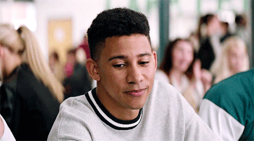
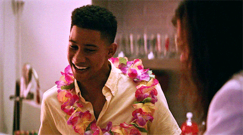
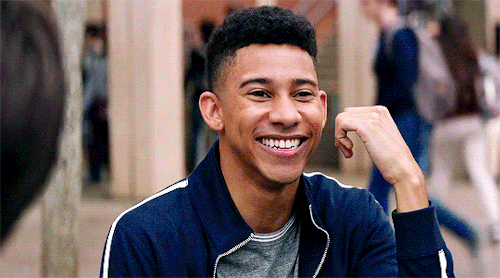
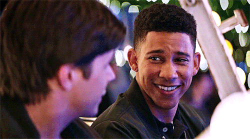
by clicking on the CONTENT SOURCE BELOW you’ll find #235 gifs of actor nathan stewart-jarett in the anthology series: soulmates ( ep 4 ). all of the gifs were made from scratch by me, and intended to be used for roleplaying purposes only. please like/reblog if you find this pack useful!
PLEASE DO NOT :
claim them as your own or add into hunts!
use in smut rps / krps, use to portray minors
use in your own graphics or crop for personal use, without visible credit
[ ! ] CONTENT WARNINGS : partial nudity, flashing lights, blood, guns, nsfw scenes (mild)


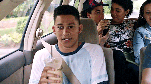
Keiynan Lonsdale as Bram Greenfeld in Love, Simon (2018) dir. Greg Berlanti
I was getting pretty fed up with links and generators with very general and overused weapons and superpowers and what have you for characters so:
Here is a page for premodern weapons, broken down into a ton of subcategories, with the weapon’s region of origin.
Here is a page of medieval weapons.
Here is a page of just about every conceived superpower.
Here is a page for legendary creatures and their regions of origin.
Here are some gemstones.
Here is a bunch of Greek legends, including monsters, gods, nymphs, heroes, and so on.
Here is a website with a ton of (legally attained, don’t worry) information about the black market.
Here is a website with information about forensic science and cases of death. Discretion advised.
Here is every religion in the world.
Here is every language in the world.
Here are methods of torture. Discretion advised.
Here are descriptions of the various methods used for the death penalty. Discretion advised.
Here are poisonous plants.
Here are plants in general.
Feel free to add more to this!
pick-me-ups for writers
for the self-conscious beginner: No one makes great things until the world intimately knows their mediocrity. Don’t think of your writing as terrible; think of it as preparing to contribute something great.
for the self-conscious late bloomer: Look at old writing as how far you’ve come. You can’t get to where you are today without covering all that past ground. For that, be proud.
for the perfectionist: Think about how much you complain about things you love—the mistakes and retcons in all your favorite series—and how you still love them anyway. Give yourself that same space.
for the realist: There will be people who hate your story even if it’s considered a classic. But there will be people who love your story, even if it is strange and unpopular.
for the fanfic writer: Your work isn’t lesser for not following canon. When you write, you’ve created a new work on its own. It can be, but does not have to be, limited by the source material. Canon is not the end-all, be-all.
for the writer’s blocked: It doesn’t need to be perfect. Sometimes you have to move on and commit a few writing sins if it means you can create better things out of it.
for the lost: You started writing for a reason; remember that reason. It’s ok to move on. You are more than your writing. It will be here if you want to come back.

✧ PAGE THEME 006: DISPLAY — BY EVANSYHELP.
A simple page theme for sharing icons, gifs, gif icons, headers – whatever you need!
FEATURES: ♡ Container size auto-adjusts to the width of your browser. ♡ Images are centered so gifs/headers won’t wrap awkwardly. ♡ Title and subtitle for FC name, project title, gif/icon count, etc.. ♡ Two navigation links. ♡ Code labelled for easy editing.
TERMS OF USE: ♡ Edit as much as you like but don’t move or remove the credit. ♡ Don’t redistribute, use as a base, or claim as your own. ♡ Please like or reblog if using.
CREDITS: google fonts, fontawesome, style-my-tooltips, preview icons. ENJOY MY CONTENT? Support me on Ko-fi & claim an exclusive reward today!
✧✧✧ ( PREVIEW. ) ( CODE. )
-
 calirph liked this · 4 months ago
 -
 dreamscorched reblogged this · 4 months ago
 -
 tenaciousindomitablewildfire liked this · 1 year ago
 -
 goodings liked this · 2 years ago
 -
 tabbybards reblogged this · 3 years ago
 -
 siobhanist liked this · 3 years ago
 -
 gloomynerd-blog liked this · 3 years ago
 -
 rnaiz liked this · 3 years ago
 -
 actressyejin liked this · 3 years ago
 -
 soleiiiiil reblogged this · 4 years ago
 -
 deliciouslinks liked this · 4 years ago
 -
 owenburnett liked this · 4 years ago
 -
 just-ali-things reblogged this · 4 years ago
 -
just-ali-things liked this · 4 years ago
-
 lilsunshiny liked this · 4 years ago
 -
 goaskmalice liked this · 4 years ago
 -
 allthelettersicanwrite liked this · 4 years ago
 -
 marysuesofrp reblogged this · 4 years ago
 -
 sil09 reblogged this · 4 years ago
 -
sil09 liked this · 4 years ago
-
 dreamsofsleepingin liked this · 4 years ago
 -
 youcantmakeme reblogged this · 4 years ago
 -
 kh-and-twewy liked this · 4 years ago
 -
 no-reason-at-all liked this · 4 years ago
 -
 libertatias liked this · 4 years ago
 -
 the-mortalboyking liked this · 4 years ago
 -
 adrina-stark liked this · 4 years ago
 -
 lovethesisyphean liked this · 4 years ago
 -
 oflosechesters liked this · 4 years ago
 -
 sircolinmorgan reblogged this · 4 years ago
 -
 themagicalshrimp liked this · 4 years ago
 -
 poc-movie-supremacy liked this · 4 years ago
 -
 loveiseeyourtruecolorsuniverse liked this · 4 years ago
 -
 habibialkaysani reblogged this · 4 years ago
 -
 emotionalsupportspoon liked this · 4 years ago
 -
 renresources reblogged this · 4 years ago
 -
 cantfightfatetoo liked this · 4 years ago
 -
 kiminyoung reblogged this · 4 years ago
 -
kiminyoung liked this · 4 years ago
-
 levicular liked this · 4 years ago
 -
 lovesyoongs liked this · 4 years ago
 -
 saphinc liked this · 4 years ago
