Please, Feel Free To Write Any WatcherDad Aus For Hollow Knight.
Please, feel free to write any WatcherDad Aus for Hollow Knight.
reblog if you’re okay with people writing fanfics of your fanfics and/or fanfics inspired by your fanfics
More Posts from Violetdawn001 and Others

What is an Artfight?
Something to have fun with!
Thank you, Cupcakeshakesnake, for giving me permission to use your designs of Lurien the Watcher and his butler! The end results looks amazing!
P.S.
If you want to check out LittleSnaketail's work, here are links to the artist's profiles!
DeviantArt: Here
Tumblr: Here

I laughed wayyyyy to hard at this.
Also, my brother's favorite joke to tell him that his favorite region is returning...well thank you OP!
Everyone: "Unova had a bunch of references to it recently and we had gen 4 games not long ago, next mainline game is gonna be in Unova!"
Also Everyone: "Gen 2 would be up for a new game soon after Let's Go did Kanto, and the whole Pokemon Present was FILLED with Johto related stuff. Next game will be Johto!"
Gamefreak:


Just saving this for future reference...
I have seen some people dont know how to install mods, or how to use them. so i wanted to write a guide how to install them and make your game mod ready, because there are so many great mods, which enhance a already great game
Download Smapi, over on https://www.nexusmods.com/stardewvalley/mods/2400 and extract it. this site requires a account, but its where most stardew mods are. the premium subscription is unnecessary, since 99% of mods will be instantly downloaded
double click whatever file corresponds to your system. i will wirte this for windows. if you use linux, follow the onscreen examples. for windows, press 1, enter, 1, enter and copy the address you see on screen which starts with "c:\" including the ""
open your steam library and rightclick stardew in the sidebar, press properties and paste the address you just copied in the launch options and close the window.
to add mods, right click stardew in your sidebar again, but press browse local files. now open the new "mods" folder. to make it easier to find, right click that folder and press "pin to quick access"
download mods and enjoy the game. go back to the "nexus mods" site and download any mods you like. if you want to start with peak, download stardew valley expanded and its required mods. one of the few mods you have a wait to download. just copy the mod into the mods folder and extract it.
a few recommendations: generic mod config menu and ui info suite
have fun!
.
What is with the Dreamers' Houses?!?! Part 3.7 Lurien's Spire - WHAT is WRONG with Lurien's Office?!?!
Welcome back! Do you remember the last part where I was talking about how Patriotic Lurien was with all the Hallownestian crests?
I was about to leave it off here, until I realized something strange. There are no King’s Idols in Lurien’s Spire. Mr.-Certified-Pale-King-Fanboy has no King’s Idol from which he would worship the Pale King. What kind of fan would not have an idol or picture of his king? Especially in his bedroom!
Again, I was going to leave it even after checking the Hollow Knight wiki. Tumblr/Ao3 artist Aspidike already wrote a whole comic on it after all, so why should I spend time on it?
Looking back on it, I really should have spent more time wondering why Lurien has no King’s Idols to worship the Pale King when HERRAH is shown to be more religious than him. The Spider Queen has a Shrine inside her den while Lurien doesn’t even have a single idol or a chapel!
I only began to look deeper at the lack of King’s Idols in Lurien’s Spire when I realized there is something else missing in the Watcher’s Spire. Take a look at the carpet in Lurien’s Office.

Why does Lurien have purple carpet that completely covers the floor? Even wrapping around the pillars leading up to his Office? Why when everywhere else in his Spire has RED flooring and Hallownestian seals…

And that’s when it hit me. Not only are there no King’s Idols in Lurien’s Spire, but there is also nothing of the Pale King in Lurien’s Office a.k.a where he lays slumbering.
Look at Lurien’s Office again.


No painting of the Pale King, only that of the City. No massive window of the Hallownest Seal, only open windows. There are Hallownest Seals on the banners…but no Monarach Wings.
Please, allow me to explain the importance of the lack of Monarch Wings. Take a look down below at the kinds of Hallownest Seals seen across Hallownest.
The above photo is a drawing as I suck at photoshop.

Design 1 or the Seal design is most reminiscent of the Pale King with his Monarch Wings, hence why it will be often referred to as the Monarch’s Seal in this essay.
Design 2 or the Crest design is the most often seen crest design across all of Hallownest. It is the center or base that Designs 1 & 3 form their own designs on. I often take it to mean Hallownest itself versus the Monarch’s Seal which brings to mind the Pale King.
Design 3 is the design, which to my knowledge, is only seen in the City of Tears, especially on the noble’s side of the City. Originally, I called it Plumage Design and pondered whether or not this was an allusion to the Pale King, but now I believe it is a homage to the White Lady. See the comparison down below.


Part of the reason why I am making such a big deal out of the different designs is due to the Medieval heritage the game Hollow Knight draws on. If kings, knights, and keeping your oaths to your lords is greatly important to the game, then having a coat of arms and its impact are not a stretch. We already saw this in Monomon’s portion of the essay when we realized that Monomon was the one in charge of the Teacher’s Archives. Due to the lack of Hallownestian crests (or anything of Hallownest) as well as symbols in the benches being Monomon’s mask, we concluded that the Teacher’s Archives was not part of Hallownest proper, but rather natural territory under Monomon’s direct charge.
Having three different Hallownestain crests is vital. While the standard Design 2 or the Crest design allows one to tell that the messenger is from Hallownest versus the Mosskin, Designs 1 and 3 allow us to tell if the message came from the Pale King or White Lady themselves. The common Hallownestian official might only bear the Crest Design while servants in the White Palace bear Designs 1 & 3. Though I bet the Queen’s gardeners only bore the Plumage Design.
With this in mind, let us turn back to Lurien’s Spire to see which crests he bears throughout.


These are all locations through-out the Watcher’s Spire containing different versions of Hallownestian crests. Now please compare these with that of Lurien’s personal Office and Final Resting Place.


Here is the ONLY Place I found the 1st design or Monarch Seal in Lurien’s Office… If you actually can count it since it’s OUTSIDE his office.

The two places where the Monarach Wings appear in Lurien’s Office are in two locations that are OUTSIDE his office. The first is on the Spire’s wall which is just typical City of Tears architecture while the second winged crest is on the elevator. AKA, a standard design that is easily removed from the room.
What does this mean for Lurien, the fandom’s Pale King fanboy, with nothing of the Pale King inside his office? This is supposed to be Lurien’s personal space where there would be tons of Pale King merch and references. Yet, upon closer examination, not only are there no references to the Pale King, but Lurien went out of his way to hid any references to the White Lady as well! The purple carpet extends all the way down, hiding Design 3 or the White Lady’s crest!

Forget any blacklash from an shocked fandom, the lack of references to the Royal Couple in Lurien’s Office reeks of possible danger for the Watcher. Lurien is the 3rd most powerful bug in Hallownest, right underneath the Pale King and White Lady. Such massive influence needs to be massively watched and carefully checked to ensure that the Watcher doesn’t use that power against the Royal Couple. Yet the Watcher, in his own personal office, does not have any direct reference to either of them.
We do not know how the Royal Couple would feel that Lurien went out of his way to not show any direct alliegance in his private workspace and room.
Now, I already know what you are thinking. Lurien’s canon dialogue in the Dream Realm. “For King Beloved…to sleep and serve…” It seems as if all of his dialogue is suggesting the exact opposite picture of Lurien’s Office, that he put the Pale King above everything…but the Pale King isn’t the only reason why he became a Dreamer. To quote Lurien’s last journel entry:
“Sleep beckons eternal and these words become my last. Though my gaze shall no longer fall upon this city, I will act forever in its protection. For King, for bug, for Hallownest, I head now to my rest.”
Lurien is a poet. 2) His actions are for the forever protection of his City. 3) Lurien’s reasons for acting are not solely for the Pale King, but for bug and Hallownest. This is important as it shows Lurien separates Hallownest from the Pale King in his mind.
While Lurien DID say “For King Beloved”, there is nothing of Pale King inside Lurien’s personal Office. It seems like the care Lurien had for the Pale King was like the love Americans have for their flag, unwilling to let the flag touch the ground…but not going so far to have the flag inside their bedrooms…unless the love for the flag goes beyond patriotism to nationalism.
Finally, what does this lack of crests mean for Lurien’s character? I am afraid that I will have to dive into symbolism to explain as a certain Watcher doesn’t have much dialogue.
The lack of Monarch crest on the banners shows how Lurien always put Hallownest first, not the Pale King’s interests. Lurien could have snuck in one of the bigger banners with the Monarch crests, but chose the smaller banner with Design 2 to hang instead. Symbolically, this shows how Lurien’s heart with the kingdom first.
The lack of the Plumage Crests was brought about by Lurien redoing the floors, turning the red floor to purple carpet. As seen before in previous essays, the color red is associated with the nobles and the majority of the Plumage Crests are seen on the noble’s side of the City. Meanwhile, the color purple is primarily seen in Lurien’s Spire AKA Lurien’s color. Just as purple takes from both red and blue to rise to higher wisdom, inspiration, and humility, so Lurien rises above the roots to see a bird’s eye view of the whole culture of Hallownest, not just the nobles who grow (pun intended) from the White Lady.
The open windows has its own symbolism as Team Cherry could have given Lurien’s Office those magnificent Monarch crest windows. Instead, they chose to not just have no seal, but almost no window. Practically, this means Lurien can easily reposition his telescope anywhere so he can see everywhere in the City. But what about symbolism? The answer is that Lurien can see everything CLEARLY and without basis. He sees what is truly there, not what the Pale King wants him to see or expects him to see. Lurien isn’t even plagued by his own personal weakness or anger that could cause the glass to fog up. He can SEE.
Yes, Monomon. You can stop listing all the things wrong with the City. Lurien already has your list and THEN some.
Here we are at the end of this section and I cannot believe that CAREPT of all things would reveal how Lurien's loyalty is to Hallownest first, not the Pale King.
If you wish to read more of the Essay, click one of these links below.
Part 1.0: Herrah's Den : Here
Part 2.0: Monomon's Archives: Here
Part 3.0: Lurien's Spire: Here
Part 3.25: Lurien's Spire: Windows and Colors: Here
Part 3.5: Even More of Lurien's Spire. Here
Part 3.7: What is WRONG with Lurien's Spire? (You are here)
Part 3.8: Even, even More of Lurien's Spire: Secret Room: Click here
Part 3.9 Watcher Knight Boss Room! Here
Part 4.0 What We Know We Don't Know About the Dreamers' Houses: Click Here
Link to essay on Ao3: Here
If you have thoughts you wish to share, please feel free to comment or reblog! Especially with the above observation!

Well, forget about a bestiary for Christmas. I should invest in a sea animal encyclopedia!
The Lancetfish is a species that looks like it comes straight out of a realistic fantasy world building project.

Excuse me while I reblog this for future reference...
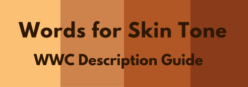
Words for Skin Tone | How to Describe Skin Color
We discussed the issues describing People of Color by means of food in Part I of this guide, which brought rise to even more questions, mostly along the lines of “So, if food’s not an option, what can I use?” Well, I was just getting to that!
This final portion focuses on describing skin tone, with photo and passage examples provided throughout. I hope to cover everything from the use of straight-forward description to the more creatively-inclined, keeping in mind the questions we’ve received on this topic.
Standard Description
Basic Colors

Pictured above: Black, Brown, Beige, White, Pink.
“She had brown skin.”
This is a perfectly fine description that, while not providing the most detail, works well and will never become cliché.
Describing characters’ skin as simply brown or beige works on its own, though it’s not particularly telling just from the range in brown alone.
Complex Colors
These are more rarely used words that actually “mean” their color. Some of these have multiple meanings, so you’ll want to look into those to determine what other associations a word might have.

Pictured above: Umber, Sepia, Ochre, Russet, Terra-cotta, Gold, Tawny, Taupe, Khaki, Fawn.
Complex colors work well alone, though often pair well with a basic color in regards to narrowing down shade/tone.
For example: Golden brown, russet brown, tawny beige…
As some of these are on the “rare” side, sliding in a definition of the word within the sentence itself may help readers who are unfamiliar with the term visualize the color without seeking a dictionary.
“He was tall and slim, his skin a russet, reddish-brown.”
Comparisons to familiar colors or visuals are also helpful:
“His skin was an ochre color, much like the mellow-brown light that bathed the forest.”
Modifiers
Modifiers, often adjectives, make partial changes to a word.The following words are descriptors in reference to skin tone.
Dark - Deep - Rich - Cool
Warm - Medium - Tan
Fair - Light - Pale
Rich Black, Dark brown, Warm beige, Pale pink…
If you’re looking to get more specific than “brown,” modifiers narrow down shade further.
Keep in mind that these modifiers are not exactly colors.
As an already brown-skinned person, I get tan from a lot of sun and resultingly become a darker, deeper brown. I turn a pale, more yellow-brown in the winter.
While best used in combination with a color, I suppose words like “tan” “fair” and “light” do work alone; just note that tan is less likely to be taken for “naturally tan” and much more likely a tanned White person.
Calling someone “dark” as description on its own is offensive to some and also ambiguous. (See: Describing Skin as Dark)
Undertones
Undertones are the colors beneath the skin, seeing as skin isn’t just one even color but has more subdued tones within the dominating palette.
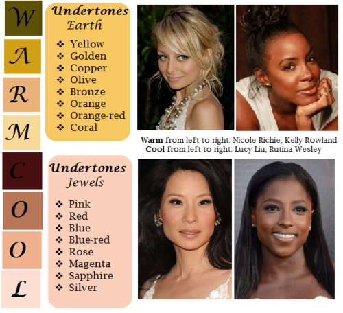
pictured above: warm / earth undertones: yellow, golden, copper, olive, bronze, orange, orange-red, coral | cool / jewel undertones: pink, red, blue, blue-red, rose, magenta, sapphire, silver.
Mentioning the undertones within a character’s skin is an even more precise way to denote skin tone.
As shown, there’s a difference between say, brown skin with warm orange-red undertones (Kelly Rowland) and brown skin with cool, jewel undertones (Rutina Wesley).
“A dazzling smile revealed the bronze glow at her cheeks.”
“He always looked as if he’d ran a mile, a constant tinge of pink under his tawny skin.”
Standard Description Passage
“Farah’s skin, always fawn, had burned and freckled under the summer’s sun. Even at the cusp of autumn, an uneven tan clung to her skin like burrs. So unlike the smooth, red-brown ochre of her mother, which the sun had richened to a blessing.”
-From my story “Where Summer Ends” featured in Strange Little Girls
Here the state of skin also gives insight on character.
Note my use of “fawn” in regards to multiple meaning and association. While fawn is a color, it’s also a small, timid deer, which describes this very traumatized character of mine perfectly.
Though I use standard descriptions of skin tone more in my writing, at the same time I’m no stranger to creative descriptions, and do enjoy the occasional artsy detail of a character.
Creative Description
Whether compared to night-cast rivers or day’s first light…I actually enjoy seeing Characters of Colors dressed in artful detail.
I’ve read loads of descriptions in my day of white characters and their “smooth rose-tinged ivory skin”, while the PoC, if there, are reduced to something from a candy bowl or a Starbucks drink, so to actually read of PoC described in lavish detail can be somewhat of a treat.
Still, be mindful when you get creative with your character descriptions. Too many frills can become purple-prose-like, so do what feels right for your writing when and where. Not every character or scene warrants a creative description, either. Especially if they’re not even a secondary character.
Using a combination of color descriptions from standard to creative is probably a better method than straight creative. But again, do what’s good for your tale.
Natural Settings - Sky

Pictured above: Harvest Moon -Twilight, Fall/Autumn Leaves, Clay, Desert/Sahara, Sunlight - Sunrise - Sunset - Afterglow - Dawn- Day- Daybreak, Field - Prairie - Wheat, Mountain/Cliff, Beach/Sand/Straw/Hay.
Now before you run off to compare your heroine’s skin to the harvest moon or a cliff side, think about the associations to your words.
When I think cliff, I think of jagged, perilous, rough. I hear sand and picture grainy, yet smooth. Calm. mellow.
So consider your character and what you see fit to compare them to.
Also consider whose perspective you’re describing them from. Someone describing a person they revere or admire may have a more pleasant, loftier description than someone who can’t stand the person.
“Her face was like the fire-gold glow of dawn, lifting my gaze, drawing me in.”
“She had a sandy complexion, smooth and tawny.”
Even creative descriptions tend to draw help from your standard words.
Flowers
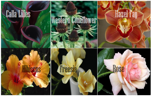
Pictured above: Calla lilies, Western Coneflower, Hazel Fay, Hibiscus, Freesia, Rose
It was a bit difficult to find flowers to my liking that didn’t have a 20 character name or wasn’t called something like “chocolate silk” so these are the finalists.
You’ll definitely want to avoid purple-prose here.
Also be aware of flowers that most might’ve never heard of. Roses are easy, as most know the look and coloring(s) of this plant. But Western coneflowers? Calla lilies? Maybe not so much.
“He entered the cottage in a huff, cheeks a blushing brown like the flowers Nana planted right under my window. Hazel Fay she called them, was it?”
Assorted Plants & Nature

Pictured above: Cattails, Seashell, Driftwood, Pinecone, Acorn, Amber
These ones are kinda odd. Perhaps because I’ve never seen these in comparison to skin tone, With the exception of amber.
At least they’re common enough that most may have an idea what you’re talking about at the mention of “pinecone.“
I suggest reading out your sentences aloud to get a better feel of how it’ll sounds.
"Auburn hair swept past pointed ears, set around a face like an acorn both in shape and shade.”
I pictured some tree-dwelling being or person from a fantasy world in this example, which makes the comparison more appropriate.
I don’t suggest using a comparison just “cuz you can” but actually being thoughtful about what you’re comparing your character to and how it applies to your character and/or setting.
Wood
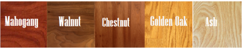
Pictured above: Mahogany, Walnut, Chestnut, Golden Oak, Ash
Wood can be an iffy description for skin tone. Not only due to several of them having “foody” terminology within their names, but again, associations.
Some people would prefer not to compare/be compared to wood at all, so get opinions, try it aloud, and make sure it’s appropriate to the character if you do use it.
“The old warlock’s skin was a deep shade of mahogany, his stare serious and firm as it held mine.”
Metals

Pictured above: Platinum, Copper, Brass, Gold, Bronze
Copper skin, brass-colored skin, golden skin…
I’ve even heard variations of these used before by comparison to an object of the same properties/coloring, such as penny for copper.
These also work well with modifiers.
“The dress of fine white silks popped against the deep bronze of her skin.”
Gemstones - Minerals
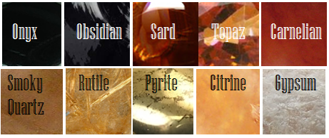
Pictured above: Onyx, Obsidian, Sard, Topaz, Carnelian, Smoky Quartz, Rutile, Pyrite, Citrine, Gypsum
These are trickier to use. As with some complex colors, the writer will have to get us to understand what most of these look like.
If you use these, or any more rare description, consider if it actually “fits” the book or scene.
Even if you’re able to get us to picture what “rutile” looks like, why are you using this description as opposed to something else? Have that answer for yourself.
“His skin reminded her of the topaz ring her father wore at his finger, a gleaming stone of brown, mellow facades.”
Physical Description
Physical character description can be more than skin tone.
Show us hair, eyes, noses, mouth, hands…body posture, body shape, skin texture… though not necessarily all of those nor at once.
Describing features also helps indicate race, especially if your character has some traits common within the race they are, such as afro hair to a Black character.
How comprehensive you decide to get is up to you. I wouldn’t overdo it and get specific to every mole and birthmark. Noting defining characteristics is good, though, like slightly spaced front teeth, curls that stay flopping in their face, hands freckled with sunspots…
General Tips
Indicate Race Early: I suggest indicators of race be made at the earliest convenience within the writing, with more hints threaded throughout here and there.
Get Creative On Your Own: Obviously, I couldn’t cover every proper color or comparison in which has been “approved” to use for your characters’ skin color, so it’s up to you to use discretion when seeking other ways and shades to describe skin tone.
Skin Color May Not Be Enough: Describing skin tone isn’t always enough to indicate someone’s ethnicity. As timeless cases with readers equating brown to “dark white” or something, more indicators of race may be needed.
Describe White characters and PoC Alike: You should describe the race and/or skin tone of your white characters just as you do your Characters of Color. If you don’t, you risk implying that White is the default human being and PoC are the “Other”).
PSA: Don’t use “Colored.” Based on some asks we’ve received using this word, I’d like to say that unless you or your character is a racist grandmama from the 1960s, do not call People of Color “colored” please.
Not Sure Where to Start? You really can’t go wrong using basic colors for your skin descriptions. It’s actually what many people prefer and works best for most writing. Personally, I tend to describe my characters using a combo of basic colors + modifiers, with mentions of undertones at times. I do like to veer into more creative descriptions on occasion.
Want some alternatives to “skin” or “skin color”? Try: Appearance, blend, blush, cast, coloring, complexion, flush, glow, hue, overtone, palette, pigmentation, rinse, shade, sheen, spectrum, tinge, tint, tone, undertone, value, wash.
Skin Tone Resources
List of Color Names
The Color Thesaurus
Skin Undertone & Color Matching
Tips and Words on Describing Skin
Photos: Undertones Described (Modifiers included)
Online Thesaurus (try colors, such as “red” & “brown”)
Don’t Call me Pastries: Creative Skin Tones w/ pics I
Writing & Description Guides
WWC Featured Description Posts
WWC Guide: Words to Describe Hair
Writing with Color: Description & Skin Color Tags
7 Offensive Mistakes Well-intentioned Writers Make
I tried to be as comprehensive as possible with this guide, but if you have a question regarding describing skin color that hasn’t been answered within part I or II of this guide, or have more questions after reading this post, feel free to ask!
~ Mod Colette
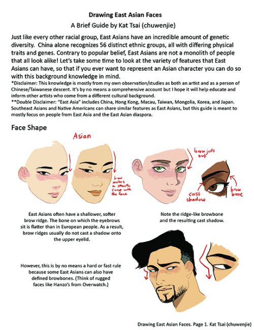
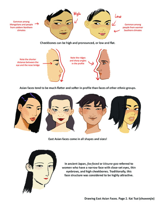

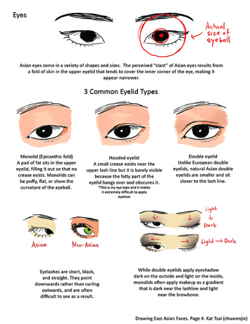

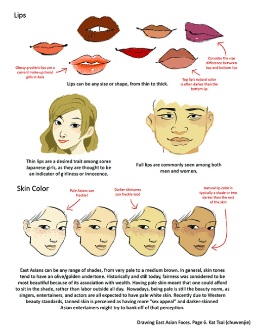
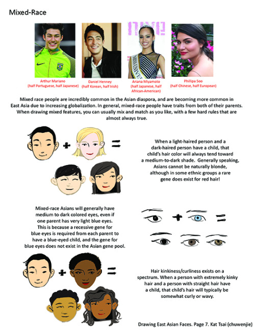
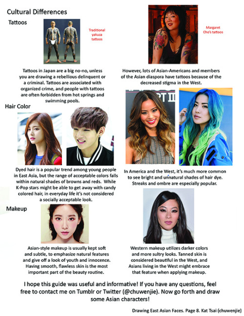
A compilation of stuff I know about drawing Asian faces and Asian culture! I feel like many “How-To-Draw” tutorials often default to European faces and are not really helpful when drawing people of other races. So I thought I’d put this together in case anyone is interested! Feel free to share this guide and shoot me questions if you have any! I’m by no means an expert, I just know a few things from drawing experience and from my own cultural background.
-
 sonicphobia0601 reblogged this · 1 week ago
 -
 mefools liked this · 1 week ago
 -
 lokigodofmschf liked this · 1 week ago
 -
 frostytheduck reblogged this · 1 week ago
 -
 chubbybunny25 reblogged this · 1 week ago
 -
chubbybunny25 liked this · 1 week ago
-
 toaster-the-bathbomb liked this · 1 week ago
 -
 frogsareslimy liked this · 1 week ago
 -
 bengefulvitch liked this · 1 week ago
 -
 haiseiscute333 reblogged this · 1 week ago
 -
haiseiscute333 liked this · 1 week ago
-
 i-will-always-love-the-jedi liked this · 1 week ago
 -
 phoenixmountaineer liked this · 1 week ago
 -
 hi-im-mizer reblogged this · 1 week ago
 -
hi-im-mizer liked this · 1 week ago
-
 adrian-cupcakez liked this · 1 week ago
 -
 solreniscool liked this · 1 week ago
 -
 sub-urbanwitch reblogged this · 1 week ago
 -
 im-just-a-ghost5 liked this · 1 week ago
 -
 neffi3 liked this · 1 week ago
 -
sub-urbanwitch liked this · 1 week ago
-
 sigmas-funky-earrings reblogged this · 1 week ago
 -
sigmas-funky-earrings liked this · 1 week ago
-
 simssssssss5 liked this · 1 week ago
 -
 maridrawss reblogged this · 1 week ago
 -
maridrawss liked this · 1 week ago
-
 theenemyod reblogged this · 1 week ago
 -
theenemyod liked this · 1 week ago
-
frostytheduck liked this · 1 week ago
-
 gayrateatingsoup liked this · 1 week ago
 -
 kirshimadenkisero reblogged this · 1 week ago
 -
kirshimadenkisero liked this · 1 week ago
-
 howdoyousleep3 reblogged this · 1 week ago
 -
 catastrophlick liked this · 1 week ago
 -
 tsfennec liked this · 1 week ago
 -
 tylertheboyo liked this · 1 week ago
 -
 venuslayla23-blog liked this · 1 week ago
 -
 modern-greek-tragedy reblogged this · 1 week ago
 -
modern-greek-tragedy liked this · 1 week ago
-
 thedungeonbat liked this · 1 week ago
 -
 nisi2805 reblogged this · 1 week ago
 -
 cocoa0crow liked this · 1 week ago
 -
 aeonsofstars reblogged this · 1 week ago
 -
 autistic-pea-princess reblogged this · 1 week ago
 -
 accidentallyadorable reblogged this · 1 week ago
 -
 brunnhildeps liked this · 1 week ago
 -
 jennyandvastraflint reblogged this · 1 week ago
 -
jennyandvastraflint liked this · 1 week ago
-
 jayjayjay719 reblogged this · 1 week ago
 -
jayjayjay719 liked this · 1 week ago
