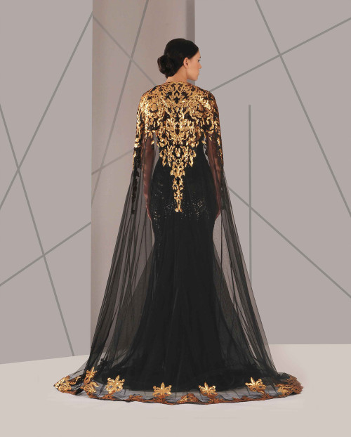
People Will Stare. Make It Worth Their While → Alberta Ferretti | Pre-Fall ‘15
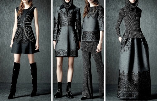
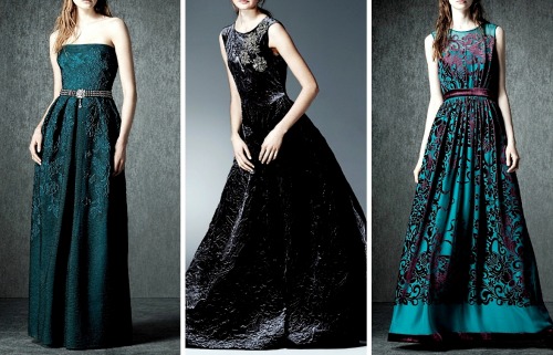

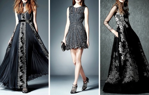
People will stare. Make it worth their while → Alberta Ferretti | Pre-Fall ‘15
More Posts from Zelo-ref and Others
Do you have any tips for drawing round ladies? :D
Hiya anon!
Well, I’m still learning myself, but here’s a few tips I usually keep in mind!
1.) “Fat” is not just a big belly!

Fat distributes everywhere, but not necessarily equally! Like at any weight, every body is different and has an unique shape! Some keep a hourglass shape, some become more pear-like, some are shaped like teardrops or apples… but the basic thing is, fat doesn’t just choose one place where it WON’T gather. It may not be as visible in some area compared to another, but in real life, it’s reeeeaaaaalllllyyyy rare to just find a person whose fat only stores in their bum, thighs and tits, leaving their waist, arms, neck and etc slim. Keep the body pleasant and thick all around, not just in the places where the weight-gain is the most imminent!
Keep the round shapes in mind!
2.) Rolls! Folds! What are they?


What are they? Not something to be afraid of, that’s for sure!
Basically, don’t hesitate to give your characters fat rolls. Skin folds, stretches and moves along with the body, and so does the fat under it! However, a lot of people who draw rolls tend to give the character many super small ones — this is not how rolls work! Usually, the thicker the person, the thicker the rolls — they increase in size, not necessarily in number.
Rolls are the most preminent in places where the body moves the most, AKA the joints. Fat folds over itself and creates creases and ‘rolls’.
3.) HOWEVER….
(No references here, sorry!!!)
When we age, our skin loses its elasticity and it can’t keep the rolls and folds thick and perky. In our youth, our weight can be held up way better than in our elderly days due to the stength and adaptivity of our skin which disappears as we age. Thus, fat tends to droop lower with older people, and the rolls appear thinner. This can also happen if someone who has had a LOT of weight packed up suddenly losing a big chunk of it — the skin can’t adapt and will begin to “droop“ down and lower. Make sure to keep such factors in mind when drawing and planning how the weight of your characters should be carried!
And then, a lil tip that;
4.) Study references and real life!
If you yourself pack some weight or have access to internet, libraries or just life on the street, you will see how bodies at different weights and shapes work and move. Use references, see for yourself — try to find how fat distributes and especially, HOW IT FOLDS! Folds and rolls seem to be one of the biggest problems many have while drawing thicker characters, and that’s ok — we’re taught as a society that fatrolls are inherently bad and disgusting, therefore there are not many situations where we’d find ourselves just… staring and studying how the fat in our bodies works and moves. You’ll learn quickly, though!
I’m still learning myself, but especially since every body is different and the weight we pack acts in unique ways, it can be really challenging to find the ‘absolute’ right way to draw thicker characters. Don’t give up! You’ll get the hang of it eventually!!


Yet another addition to the ever evolving FF7 au…. A newer take on Aerith, because the old design, while I liked it, was really lacking in some areas. I wanted to push her sarcasm and slightly manipulative streak but combine it with a youthful look, giving her that ageless feel. Aside that there’s a bunch of aesthetic changes, like the design of her dress and such.
Tifa worked out pretty well the first time, but I wanted to refine her outfit and personality a bit more. Less drastic than Aerith but I wanted Tifa to look more stubborn and brash. Like she’s always got something to prove.
Sorry for the repost XD Just thought i’d throw Tifa in there too.


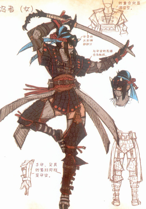
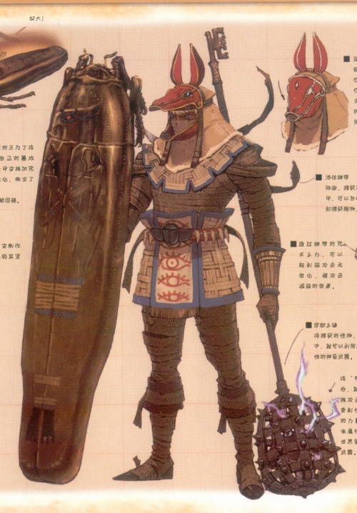
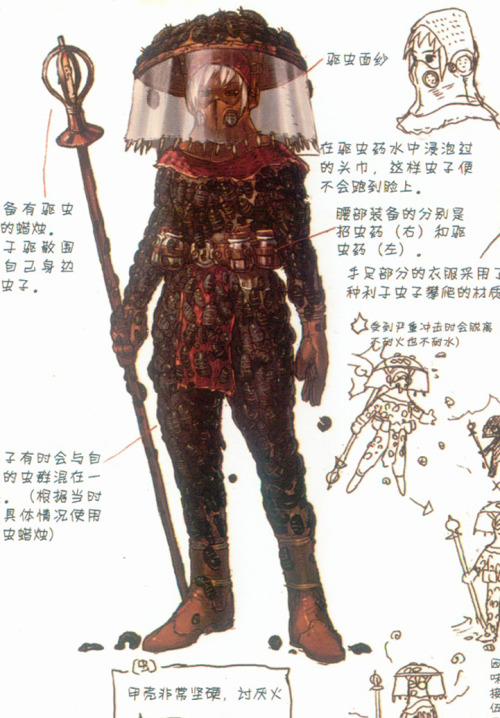
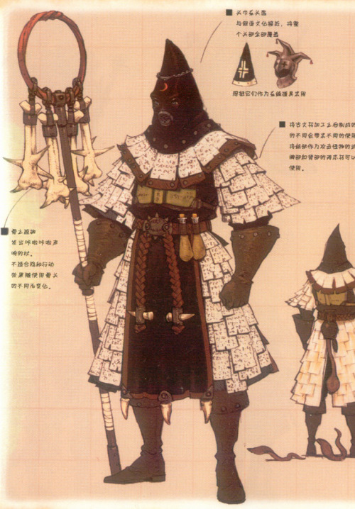
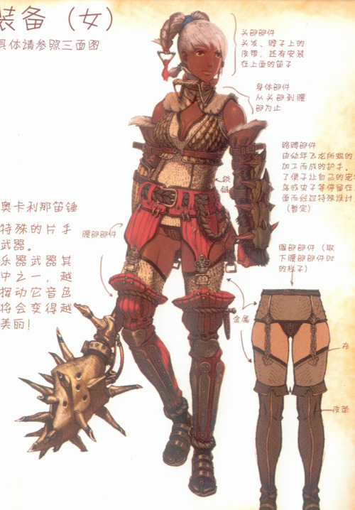
My favourite character designs from Monster Hunter Illustrations Vol. 2 (2013), a 400 page art book featuring a crap-load of creature, character, armour and weapon designs. The armour designs are so detailed and varied in cultural influences. Non-stop inspiration in this book.

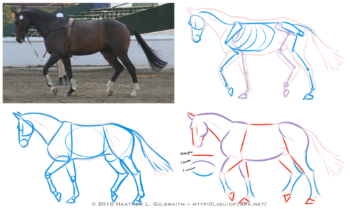
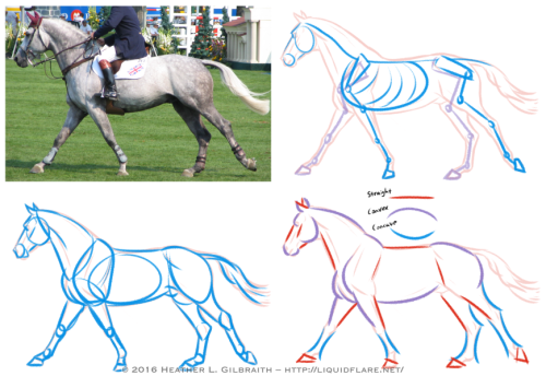
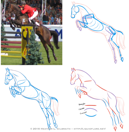
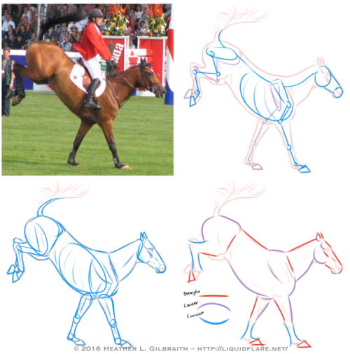
– Horse Drawing Tips –
Hello, all! I thought I’d put this together to try and give people a place to start when trying to learn about and understand horse anatomy. Drawing horses, like anything else, definitely requires some work and observation to be able to draw confidently, but some of the these ideas/tips can help you find ways of analyzing references and simplifying forms to make the journey easier. Drawing horses doesn’t have to be scary! Read on for some notes on the drawings above…
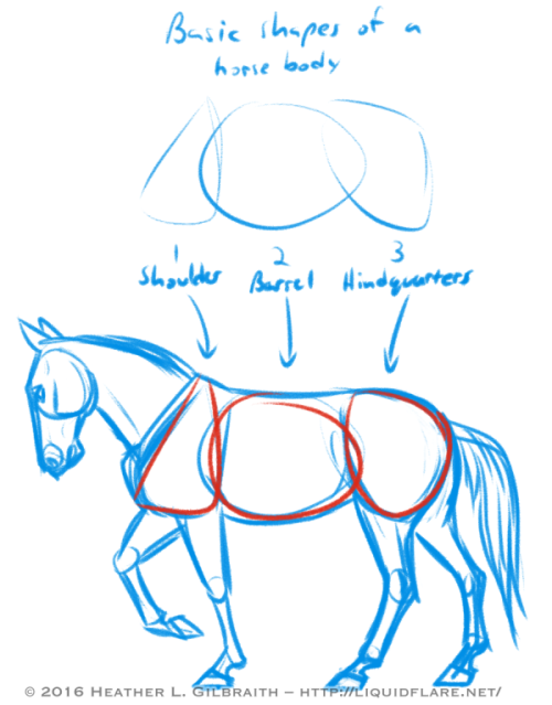
Basic Shapes of a horse body:
Use these shapes to help you block in the body forms of your horse and to help you simplify the anatomy of the horses you draw. When you study photos of horses, try to see how these shapes move/stretch in relation to the horse’s pose/action.
Horse Anatomy Studies:
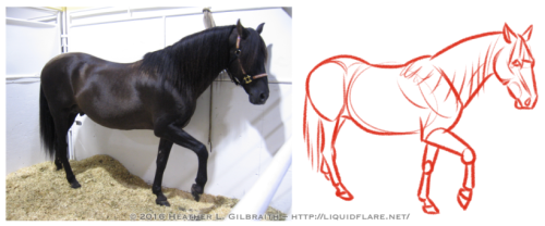
1) Standing/Walking:
a. Reference photo – Start with a photograph that you’d like to study. Try to choose a clear one with visible anatomy (obscured as little as possible) and interesting shapes.
b. Outline – The outline gives me a point to start from to analyze the anatomy of the horse from the photograph. I use it as a guide for the next few steps.
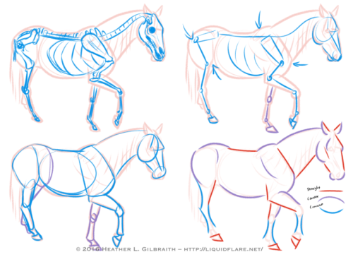
c. Skeleton – The skeleton usually takes too much time to do with every photograph, but it’s very helpful to be aware of the bones of a horse, so you know what you’re working with. Do a few of these with a drawing/photograph of a horse skeleton for reference and familiarize yourself!
d. Simplified Skeleton – Then draft out a quick, “simplified” skeleton. Try to block out the important angles, joints, and important anatomy reference points, such as the shoulder/elbow bones and the hip/knee bones. These angles will go a long way to helping you get the proper feel for a horse and the way its body naturally moves.
e. Simple Block Shapes – From there, block out the forms of the horse. Keep the skeleton in mind, but be aware of the masses of muscle and fat that moves with and covers the bones. Find ways to simplify the shapes that work for you, and try using these shapes in the future when blocking in a drawing of a horse.
f. Curves vs. Straights – Juxtaposing curved (both concave and convex) and straight lines helps to emphasize the anatomy, and add a pleasing sense of rhythm to your drawing. Experiment with emphasizing convex curves vs. concave curves, or straights against curves, etc., to get a look that is pleasing to you and also compliments the horse’s anatomy.
2) The Trot: The trot is a horse’s natural “jogging” gait, the next gait up from a walk. When trotting, the horse almost always has at least one, usually two, hooves on the ground at any moment. Remember that in most cases, horses walk/trot/canter/etc. with opposite legs moving together or in sequence; for example, right front leg raised, and left back leg raised, while the other two legs (left front leg and right front leg) are bearing the weight. Remember this when sketching your horse’s pose! (The exceptions to this are pacers and Icelandic horses doing the “tolt”, feel free to look them up!) When drawing this gait, it is sometimes helpful to emphasize the two opposing legs that mirror each other; with two legs straight/weight-bearing, and too legs extended/bent/moving. Keep the opposing legs in tandem with one another and you’ll have this gait down!
3) The Canter/gallop: Cantering is a horse’s natural running gait. In this gait it’s possible for all of a horse’s hooves to leave the ground for a moment with each stride. If a canter is a horse’s equivalent a human’s run, then a gallop is a sprint; in a gallop a horse reaches its maximum stride length and speed, though they don’t have the endurance to keep a full-on gallop up for long. When drawing the canter, watch out for which legs are bearing the weight and use that the guide you. (In my photo example, the right back leg and the left front leg are currently bearing the weight, with the right front leg about to take the weight to allow the left front leg to raise. Ugh, complicated…!)
4) The Jump: It’s when jumping that a horse reaches its maximum “stretch”! Keep in mind that a horse’s back is not very flexible (which is what makes them great to ride!), so try to keep that spine straighter/stiffer than you would for a dog or a cat. Bending the horse’s spine too much will start to make it look broken, or at the very least, very old and decrepit, as horse’s spine starts to bend/sag with age.
5) The Landing: To emphasize the weight of a horse coming down on its front hooves, be sure to bend it’s “toe joint”, or pastern, so that its fetlock or knuckle joint is nearly touching the ground. Let that joint bend to absorb the shock of the landing!

Try to avoid these common anatomy mistakes when drawing horses. Study photos and the horse’s skeleton/anatomy to avoid these! (And seriously, please forgive how horrible these drawings are! I literally whipped them up in only a few minutes, haha…)
Afficher davantage
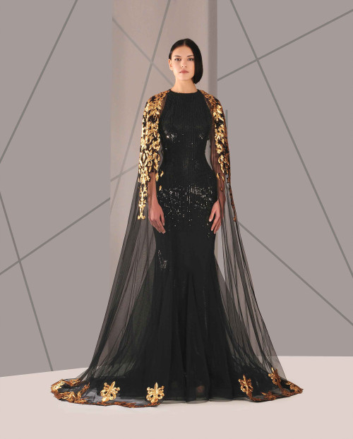
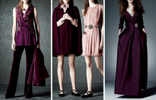
Antonios Couture
Spring | Summer 2016


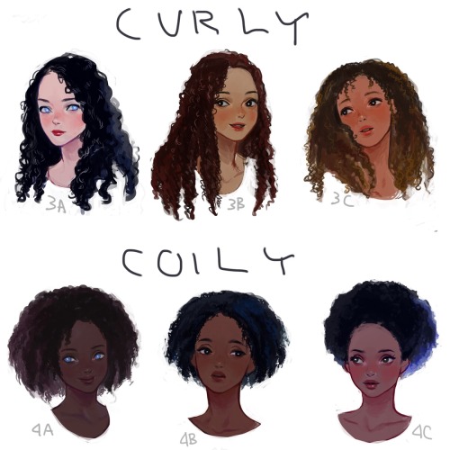
I drew a visual hair type classification guide. I thought I’d share it here. Mine is between 1b-1c.
-
 trans-loki liked this · 7 months ago
 -
 aaustinwrites reblogged this · 10 months ago
 -
 cryingpinktears liked this · 10 months ago
 -
 cayucat liked this · 1 year ago
 -
 hailodinson reblogged this · 1 year ago
 -
hailodinson liked this · 1 year ago
-
 martialwriter liked this · 1 year ago
 -
 hairbymetalmoose liked this · 2 years ago
 -
 kosemsultanim liked this · 2 years ago
 -
 yavannamire reblogged this · 2 years ago
 -
 lostwithbonzo liked this · 3 years ago
 -
 bubblegumlover99 liked this · 3 years ago
 -
 the-three-judges liked this · 4 years ago
 -
 thinskinnythin reblogged this · 4 years ago
 -
thinskinnythin liked this · 4 years ago
-
 catherinebronte reblogged this · 4 years ago
 -
catherinebronte liked this · 4 years ago
-
 adragonsnappersthings reblogged this · 4 years ago
 -
 managodess reblogged this · 5 years ago
 -
 zerases liked this · 5 years ago
 -
 pekkalastrega reblogged this · 5 years ago
 -
 sylvieons reblogged this · 5 years ago
 -
 inabsolutepitch reblogged this · 5 years ago
 -
 damaratsu reblogged this · 5 years ago
 -
 bitchibaphomightbe liked this · 5 years ago
 -
 bramblemantle liked this · 5 years ago
 -
 snertd liked this · 5 years ago
 -
 tiredeldritchhorror liked this · 5 years ago
 -
 therewasnofire reblogged this · 6 years ago
 -
 yasseraracat reblogged this · 6 years ago
 -
 agent-upsilon21 liked this · 6 years ago
 -
 mars-sweet-revenge liked this · 6 years ago
 -
 moon-boi-is-lost liked this · 6 years ago
 -
 abstrusetheorist reblogged this · 6 years ago
 -
 alayneclegane reblogged this · 6 years ago
 -
 undutchable11 reblogged this · 6 years ago
 -
 fidelishaereticus liked this · 6 years ago
 -
 romulousofatlantis liked this · 6 years ago
 -
 lilac-buttons liked this · 6 years ago
 -
 gorgeousgalatea liked this · 6 years ago
 -
 judgmentalfishnun reblogged this · 6 years ago
 -
 doing-talking reblogged this · 6 years ago
 -
 2and1things liked this · 6 years ago