Oh, Really Like That Description. The 19th Century Works Have Some Distinct Charm. Sadly, Because A Lot
Oh, really like that description. The 19th century works have some distinct charm. Sadly, because a lot of such works are forced to study at schools, where children are mostly just unpreapred and unable to see all the deatils, simply because they're young, therefore can't fully appreciate the writing. But then later in life it's fun to read actually!
Every 21st century piece of writing advice: Make us CARE about the character from page 1! Make us empathize with them! Make them interesting and different but still relatable and likable!
Every piece of classic literature: Hi. It's me. The bland everyman whose only purpose is to tell you this story. I have no actual personality. Here's the story of the time I encountered the worst people I ever met in my life. But first, ten pages of description about the place in which I met them.
More Posts from Shinyvoidcloud and Others

Hey, that’s me
This looks so nice! Not very vibrant but still colourfull palettes. Love this


June 2021 Illustrations ヽ(• ‿ •)ノ


#543 - #544 - #545. As Venipede evolves, its carapace becomes a dull cocoon as its insides liquify, and if anything tries to break it, it'll stab them aggressively until dead. It regains its lustrous carapace after evolving and becomes docile, giving rides to smaller pokémon and humans it meets.
Sponsored by @madsk3tch. Design process under read more.
I had a pretty solid idea for scolipede itself: Make it more buggy, reference centipede anatomy, but keep its horse whimsy. I did many study of centipede faces and anatomy to figure out how to place their antennae and ultimate legs (thats what the final pair of legs that look like antennae on the end of centipedes is named!). I wanted to keep some of the horn shapes, and also have the tail look like a false head like it does in many centipedes.

The weird eye shape of these guys is referencing the ocelli of centipedes: forming compound eyes. The spikes are actually referencing a milipede instead of a centipede, Desmoxytes purpurosea, who have big pink spikes. The empty spot is meant to look like a little saddle :) and the difference in color is because i think bright green feels more toxic paired with red than the greyish purple the canon one has.
venipede was easy, adapting the canon simplicity and then just adding some centipede anatomy like the antennae below the carapace.
whirlipede however, was pretty annoying. I didnt know what to do with it! i didnt want to just make a wheel but didnt want for it to just look like a venipede curled up. i decided to go the cocoon route: the carapace is protecting the goo inside. centipede dont go through cocoon phases but shhh. made it dull to keep its unique color from the rest of the line that the canon one has.

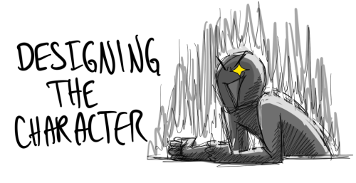

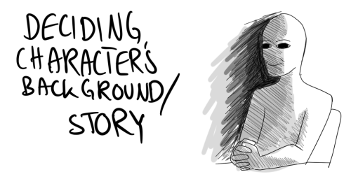
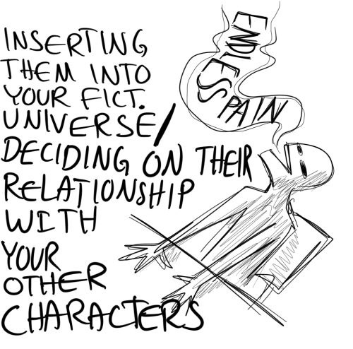
the suffering never ends
Really like this.
I like how most of the game is black and white, but the fandom decided to colour it. Make the whole world bright again.
Thank you for using more colours than just the well known red. Looks good <3

catharsis.


wanted to do some studies of their faces so I could get used to their features! it was really fun breaking their designs down :)
maybe when the game releases I’ll be able to do proper guides for their faces at all angles lol
"You don't know me. I'm not the same person anymore."
"That's okay. I'll get to know you again."

i hate the part of depression that’s like all the things that bring me joy are empty and i can’t do anything. like come on bitch i know you love book can you just be happy about book :/
-
 basicallyadragon reblogged this · 1 week ago
 -
 minecraftfaggot reblogged this · 1 week ago
 -
 calugaritsa liked this · 1 week ago
 -
 weareallpanickingatthisdisco liked this · 1 week ago
 -
 theworld-at-a-standstill liked this · 1 week ago
 -
 positively-liz reblogged this · 1 week ago
 -
 regulusblackneedsfloaties liked this · 1 week ago
 -
 ketsisnotok reblogged this · 1 week ago
 -
 faeyells reblogged this · 1 week ago
 -
faeyells liked this · 1 week ago
-
 gimme-da-sword reblogged this · 1 week ago
 -
gimme-da-sword liked this · 1 week ago
-
 phrogthegene liked this · 1 week ago
 -
 toastisnervous reblogged this · 1 week ago
 -
toastisnervous liked this · 1 week ago
-
 to-watch-it-all-burn reblogged this · 1 week ago
 -
to-watch-it-all-burn liked this · 1 week ago
-
 thishumanformislimiting reblogged this · 1 week ago
 -
 paloma-ascends-into-hellfire reblogged this · 1 week ago
 -
paloma-ascends-into-hellfire liked this · 1 week ago
-
 tomatotomahtoworld liked this · 1 week ago
 -
tomatotomahtoworld reblogged this · 1 week ago
-
 hijabi-flavored-nerd reblogged this · 1 week ago
 -
 cassthecrypt1d liked this · 1 week ago
 -
 iampresent reblogged this · 1 week ago
 -
 jinxed-starry-pages reblogged this · 1 week ago
 -
 magdabuena liked this · 1 week ago
 -
 thoughts-of-caly reblogged this · 1 week ago
 -
 xx-dark-dart-xx liked this · 1 week ago
 -
 im-too-emotionally-involved reblogged this · 1 week ago
 -
im-too-emotionally-involved liked this · 1 week ago
-
 hmmm-trauma liked this · 1 week ago
 -
 partlysunny15 liked this · 1 week ago
 -
 ramblings-of-lola reblogged this · 1 week ago
 -
 lmpelnineed reblogged this · 2 weeks ago
 -
 catiematie reblogged this · 2 weeks ago
 -
 gryffindorbraids liked this · 2 weeks ago
 -
 megkenobi reblogged this · 2 weeks ago
 -
 caesarclowningaround reblogged this · 2 weeks ago
 -
caesarclowningaround liked this · 2 weeks ago
-
 lumiereandcogsworth reblogged this · 2 weeks ago
 -
 mothinthegutter liked this · 2 weeks ago
 -
 ieles-hora liked this · 2 weeks ago
 -
 marinaslibrary reblogged this · 2 weeks ago
 -
 fynne liked this · 2 weeks ago
 -
 freefalldream reblogged this · 2 weeks ago
 -
 ringo-rocks liked this · 2 weeks ago
 -
 wheretheredrosesgroww liked this · 2 weeks ago
 -
 m3ab reblogged this · 2 weeks ago
 -
 czechmatee7 liked this · 2 weeks ago